about the project
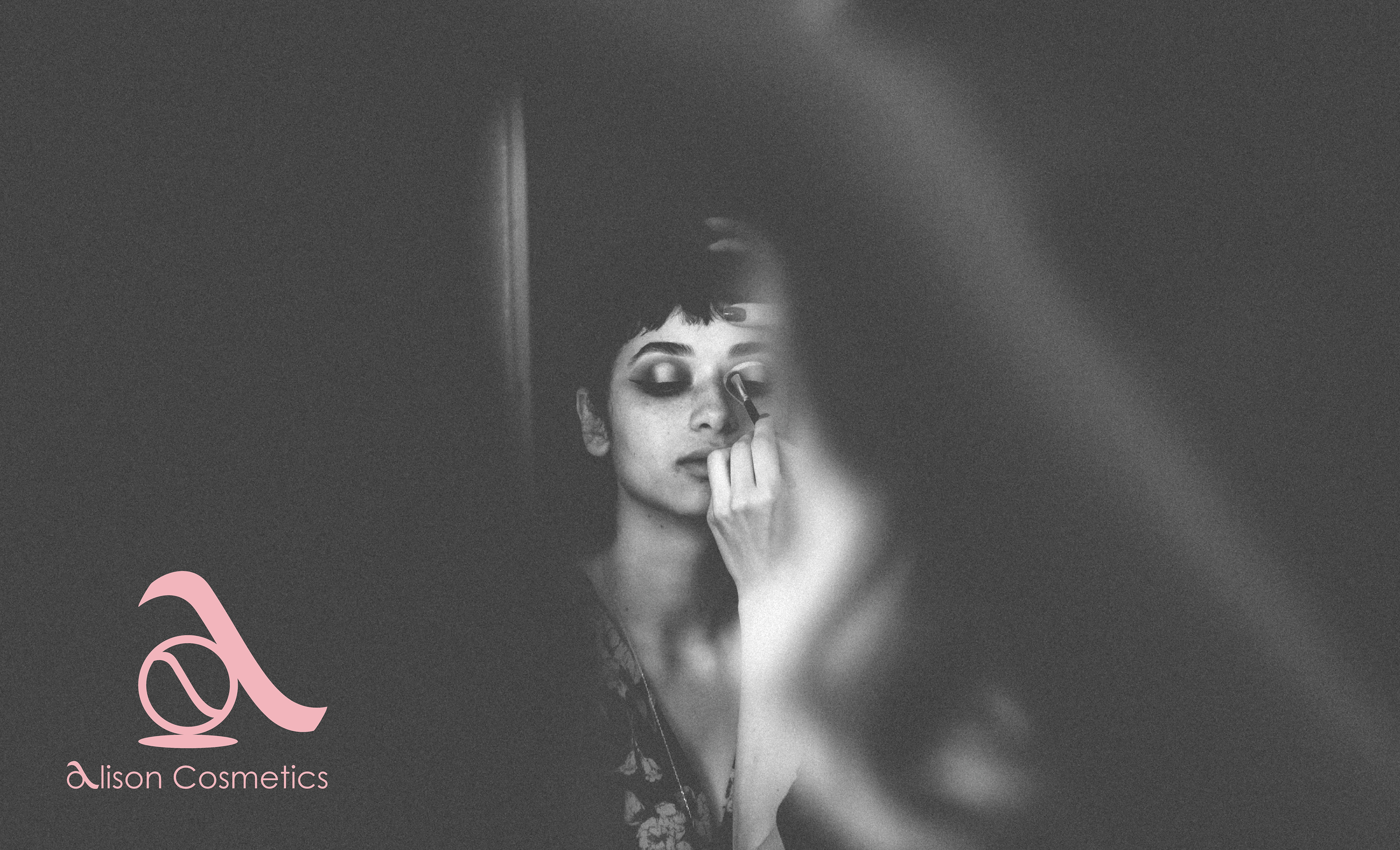
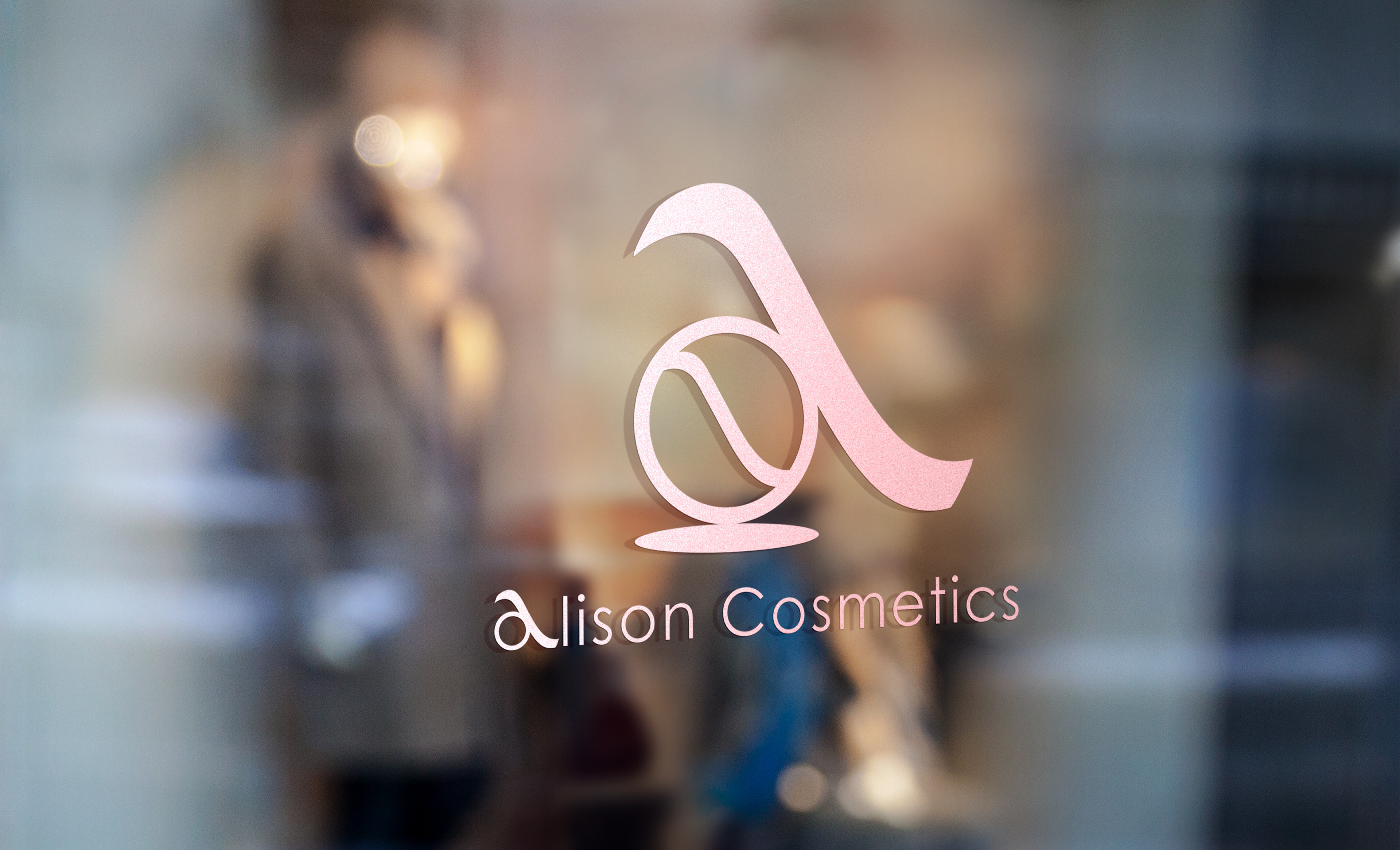
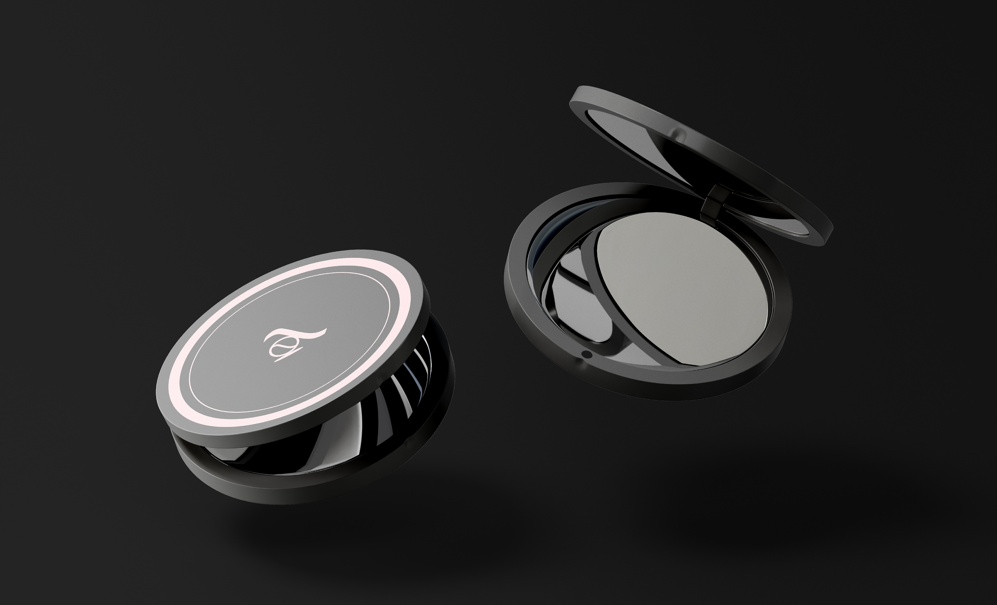
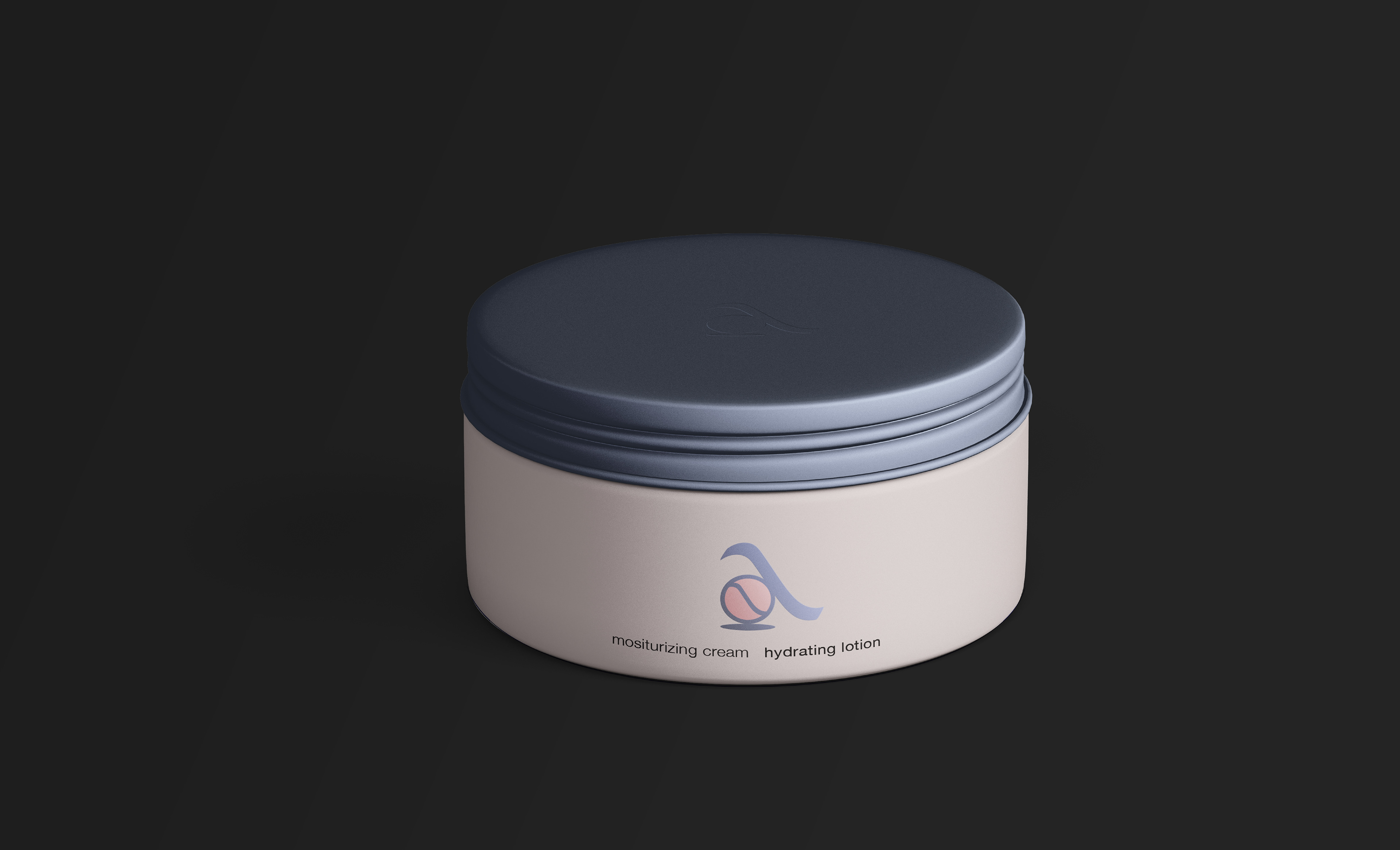
I worked on designing a functional logo for Alison Cosmetics as an assignment for my Logo Design Masterclass at Logocore. Alison cosmetics is an online store that sells lipsticks, eyeliners and eyeshadows.
the challenge
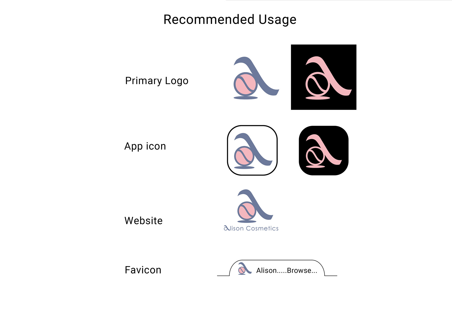
To create a logo which clearly communicates what the store sells in addition to designing something that will look good at smaller sizes was a challenge that I enjoyed.
the approach
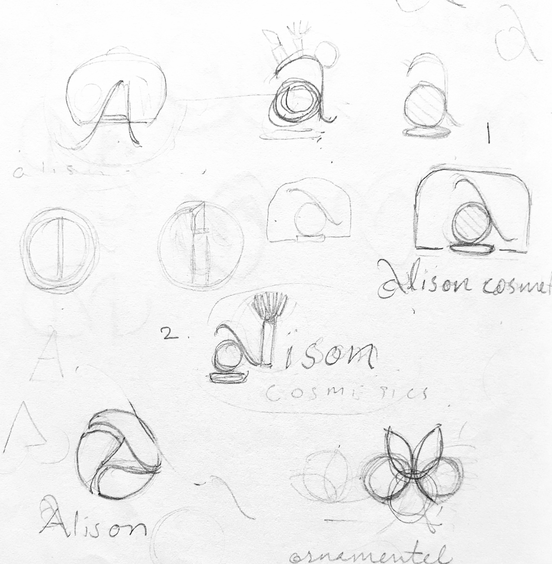
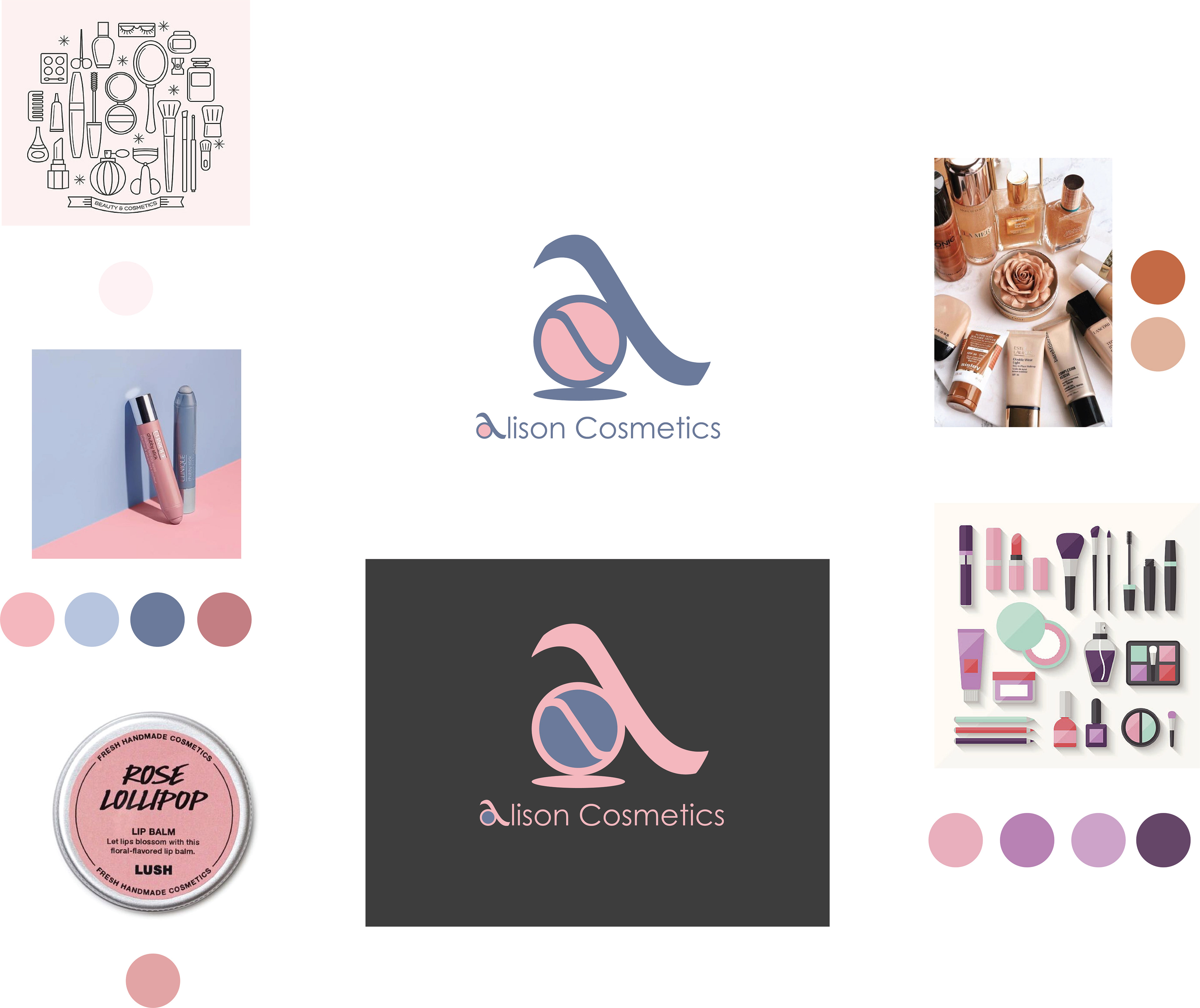
After sketching out a few variations for the logo, I came to the following thought: instead of having a random symbol or mark as the logo for this company, I preferred to use their initial 'A' and see whether I could communicate the brand essence through it. Playing around with the letterform led me to the skeleton of the logo that looked great. The divider in the bowl part of 'a' implies it is a blush container.
color and typography
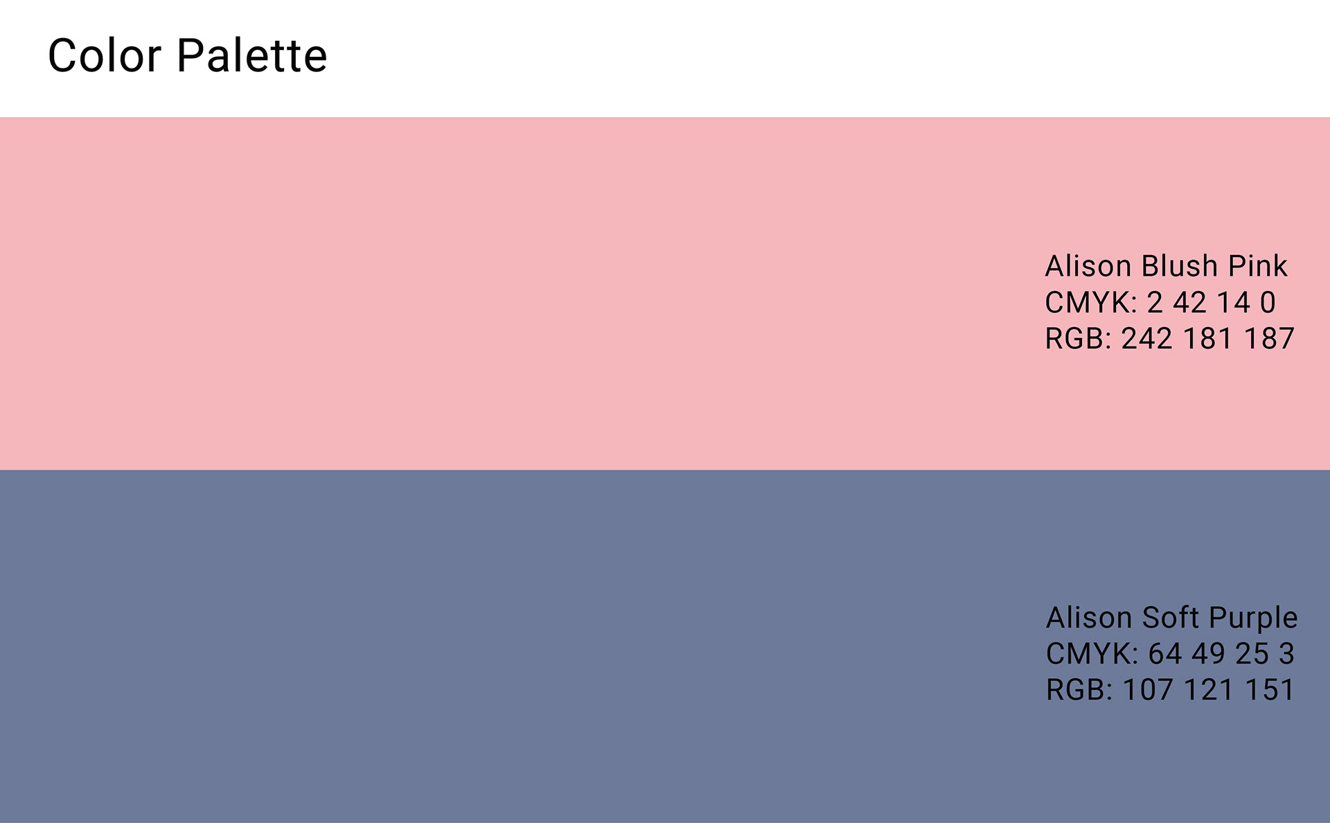
The color palette was inspired by the moodboard where I had collected a range of images. Since the client had specifically mentioned they needed soft colors, I chose to go with blush pink and an unconventional soft purple.
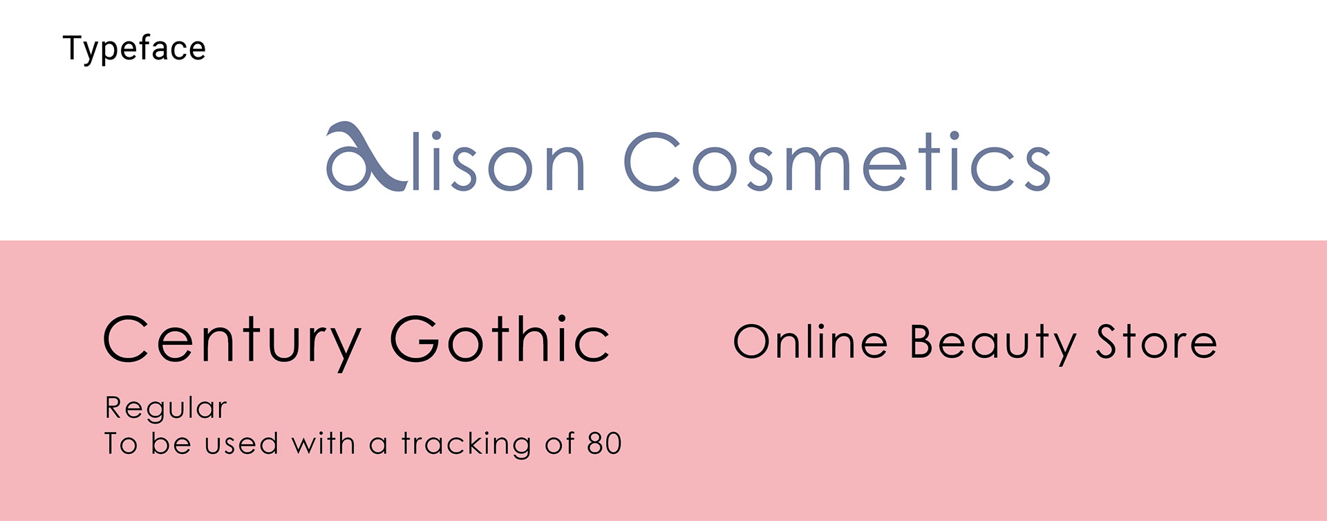
I purposefully selected a geometric typeface to go with this logo since I wanted the 'o' in it to match the completely circular bowl of 'a' in the logo.


Thank you for watching!