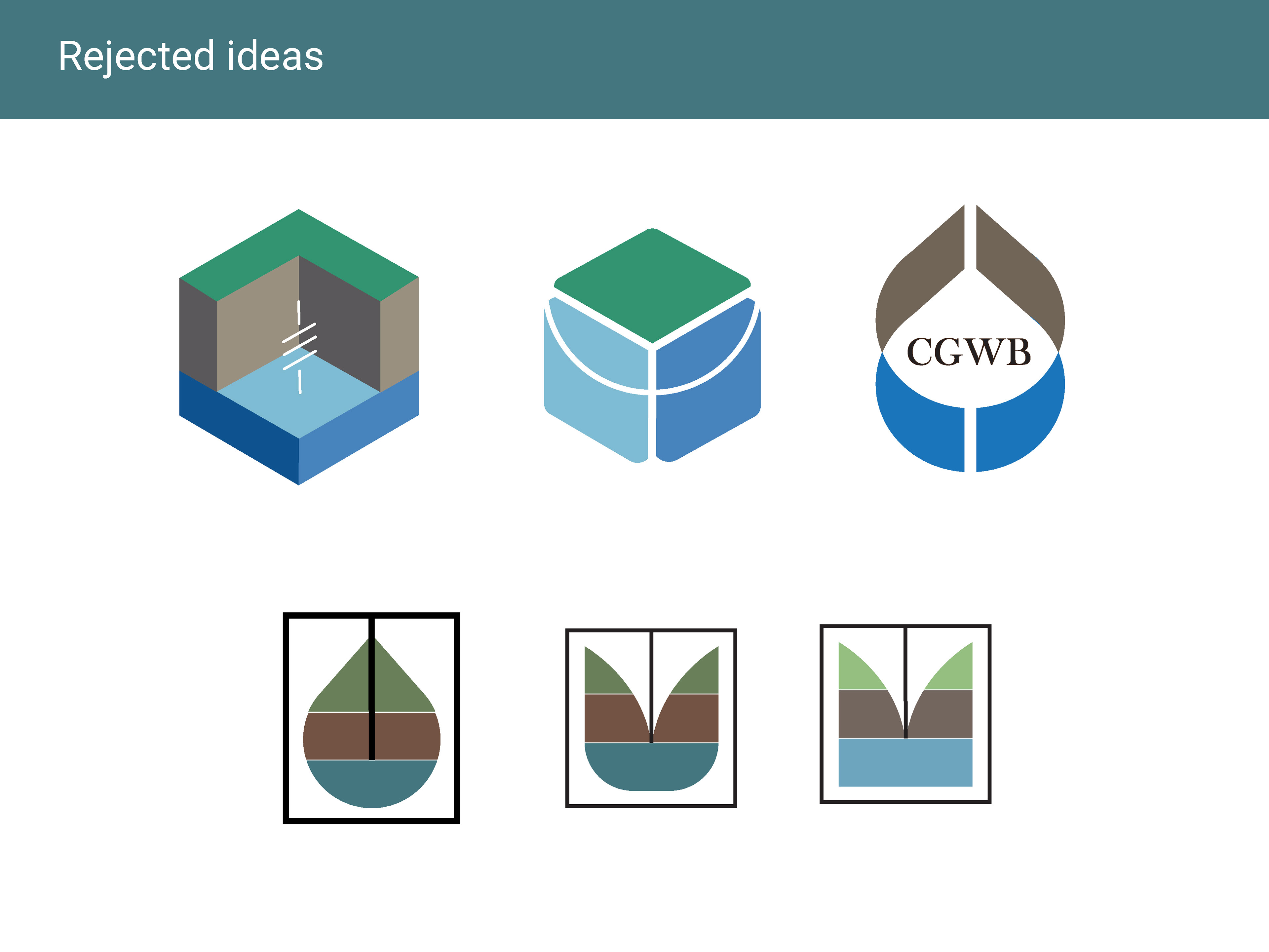
I worked on designing a logo for this organization that would clearly communicate the client’s vision. It was tricky and challenging to design an identity that was simple in form and yet would visually convey all that the board does to manage the ground water resources of the country.
After sketching out a few variations in my notebook, I moved to Illustrator to play around with the color combinations.
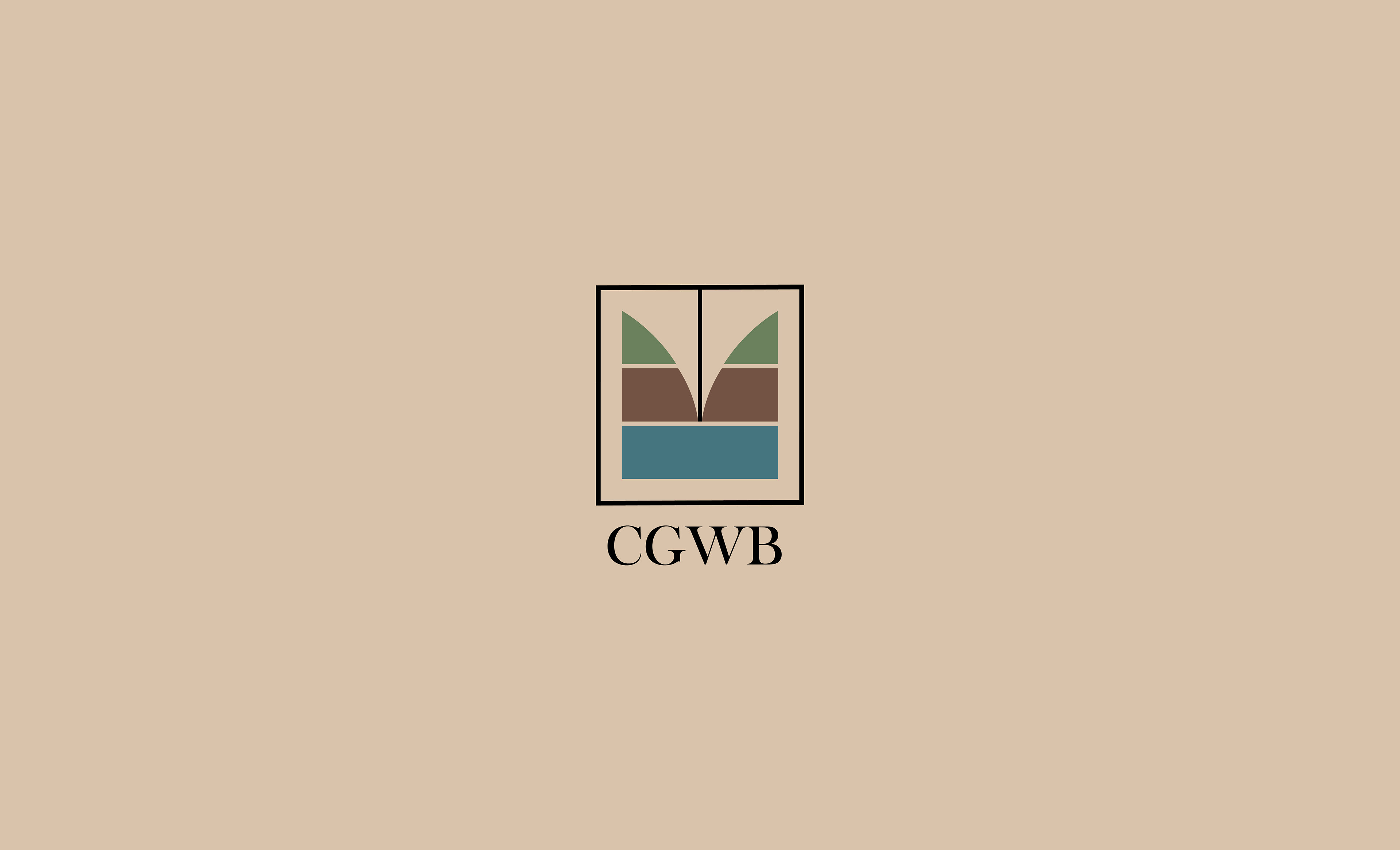
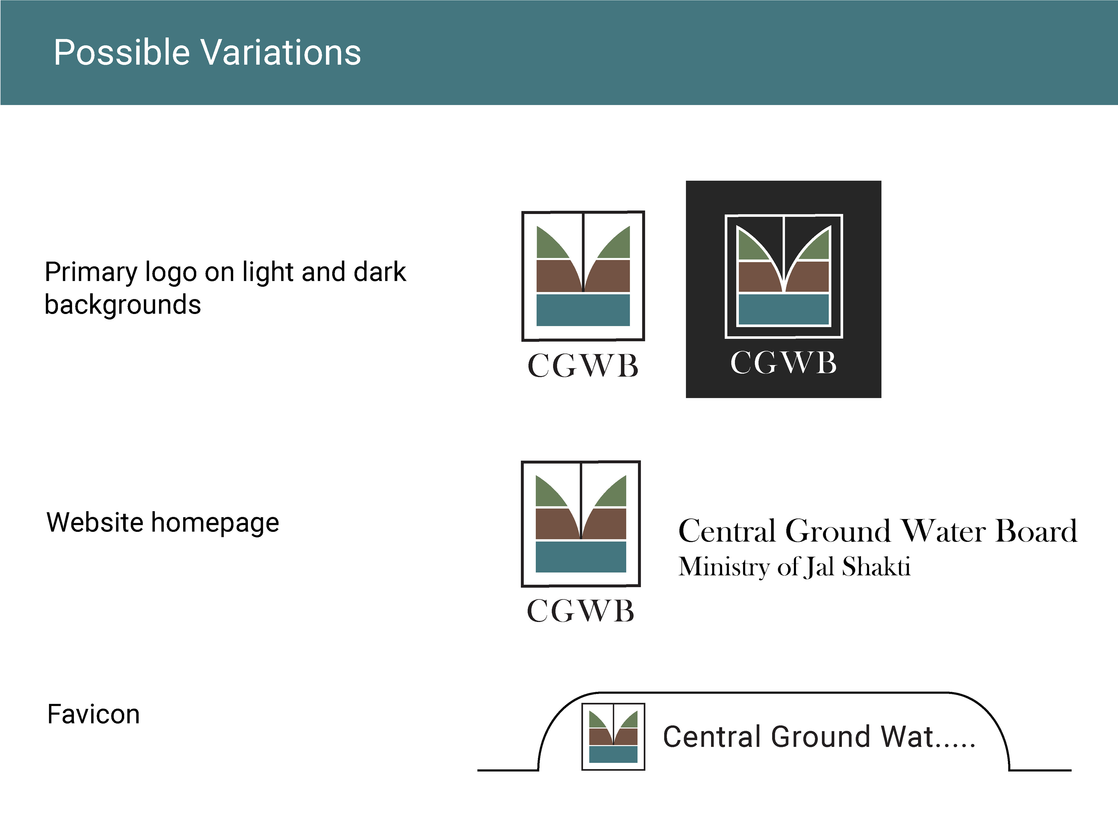
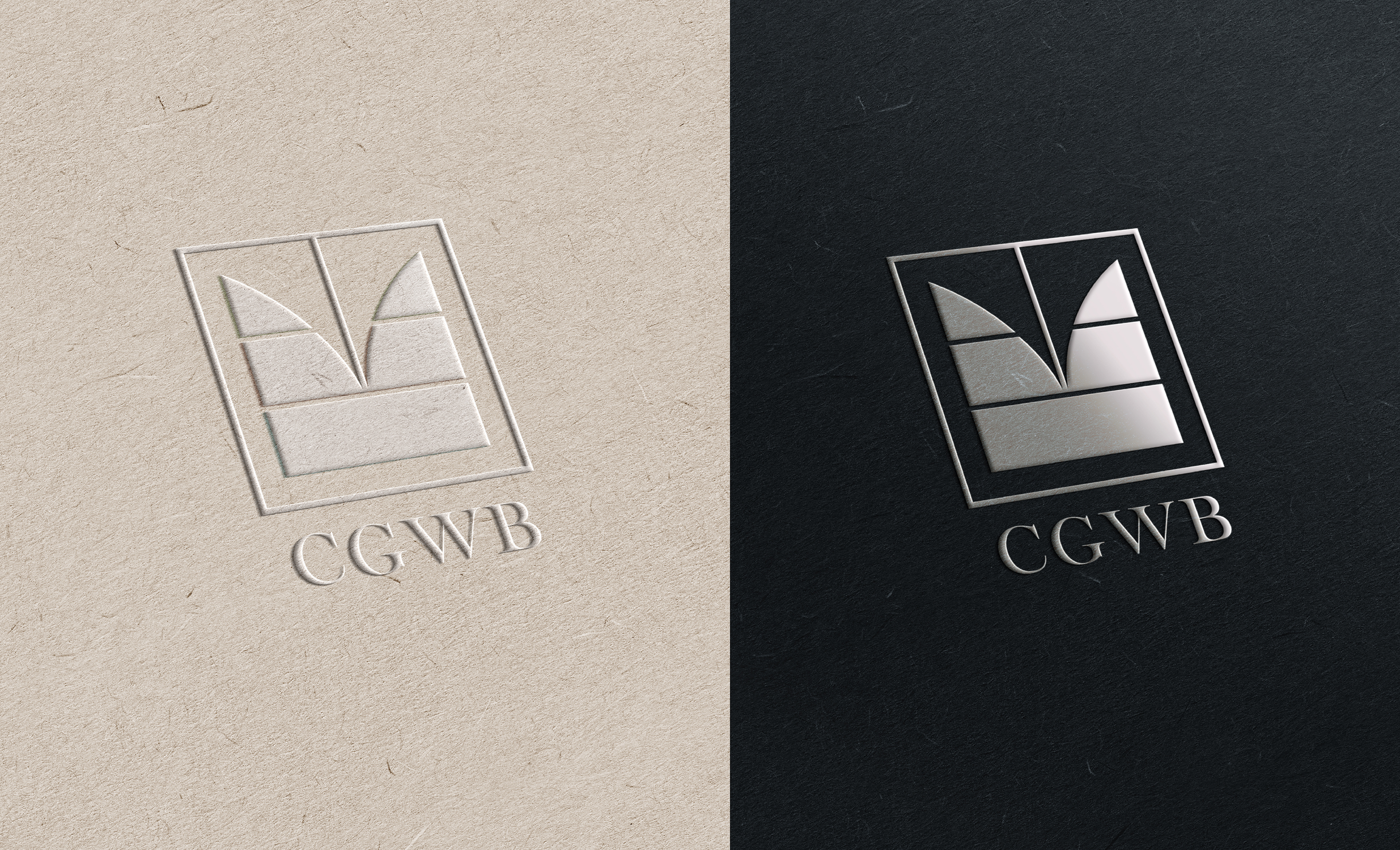
Final logo justification:
The central vertical line going down to the water table symbolizes ground water management/ monitoring/ water pump. The rectangular enclosure around the main body of the logo symbolizes resource protection and the board as a committee. The layering denotes the water location below the ground and the earthy color palette makes it more clear.

Thank you for watching!