I got a chance to work for this client to create their logotype. I decided to use my calligraphic skills to design the identity of Pakeeza, which makes it classic and unique. I had been given full freedom to experiment with different scripts, with their only requirement being having a golden yellow color for the logotype.


With an intention of creating an identity that would look delicate, elegant and convey the essence of the brand, I started out with pointed pen scripts. I began with adding flourishes and ornaments to the letters to bring out the chikankari quality of intricacy.
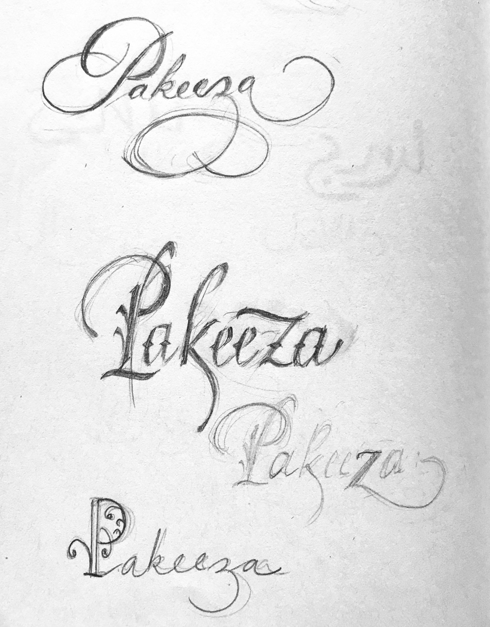
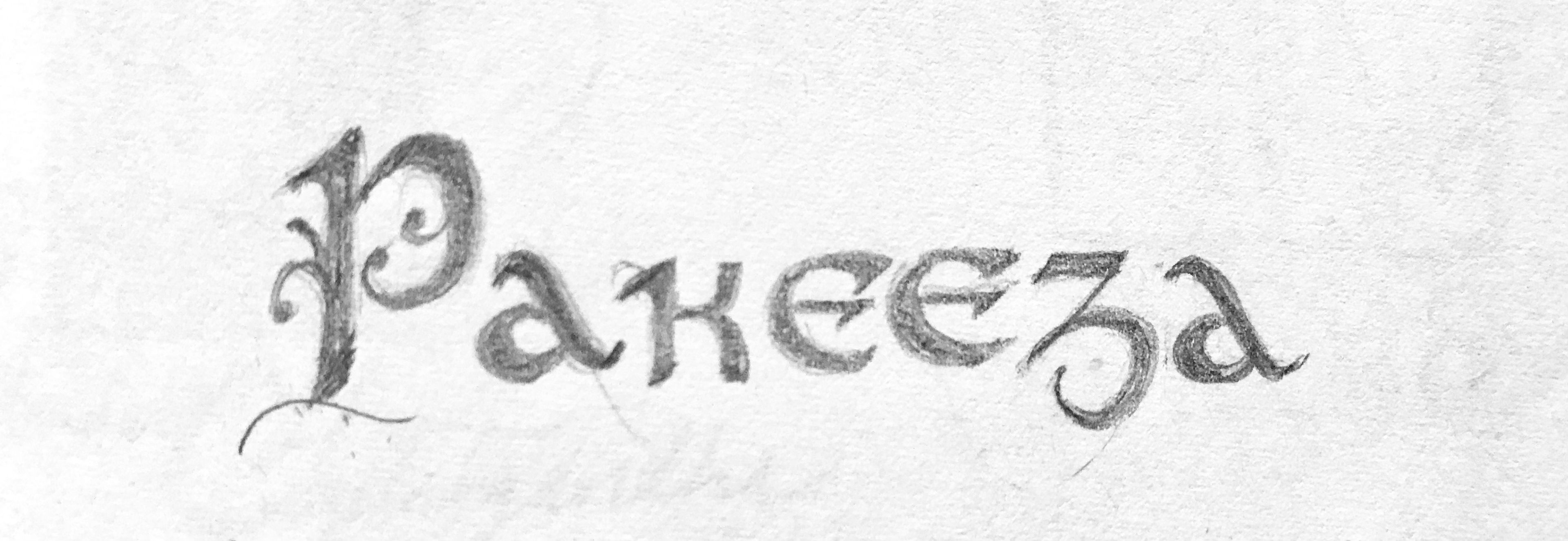
Then I decided to play around with broad edge scripts and add similar meaningful flourishes and ornaments to them. The client selected the below logotype as final. They loved the way the flourishes on the P and the z bring balance and stability to the logotype.
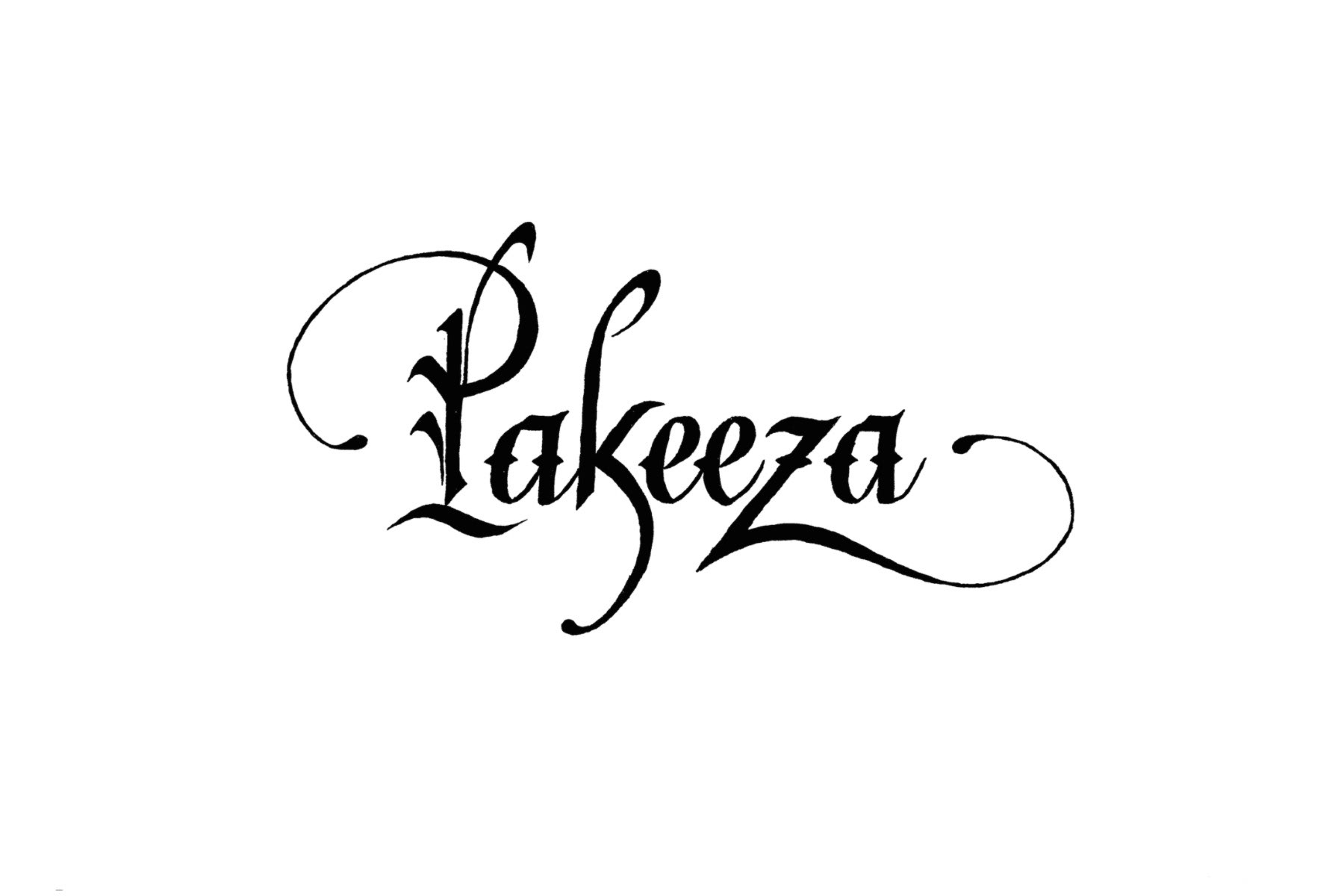
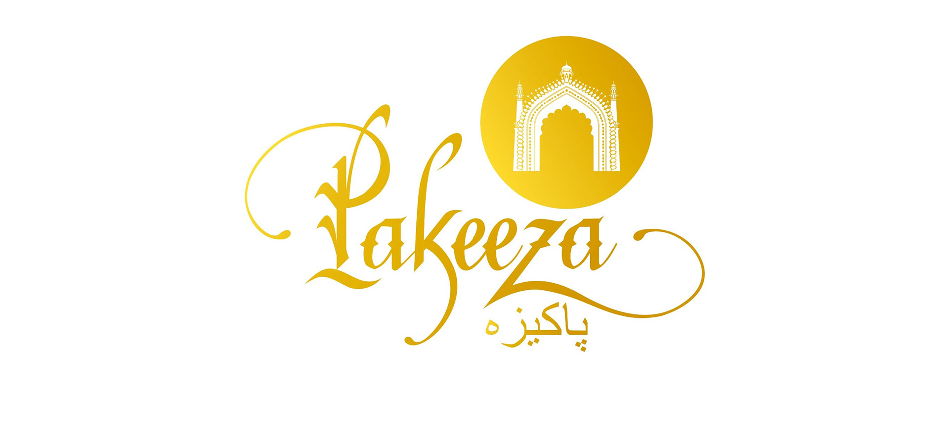
The logotype in english as designed by me. The circular mark was added later.
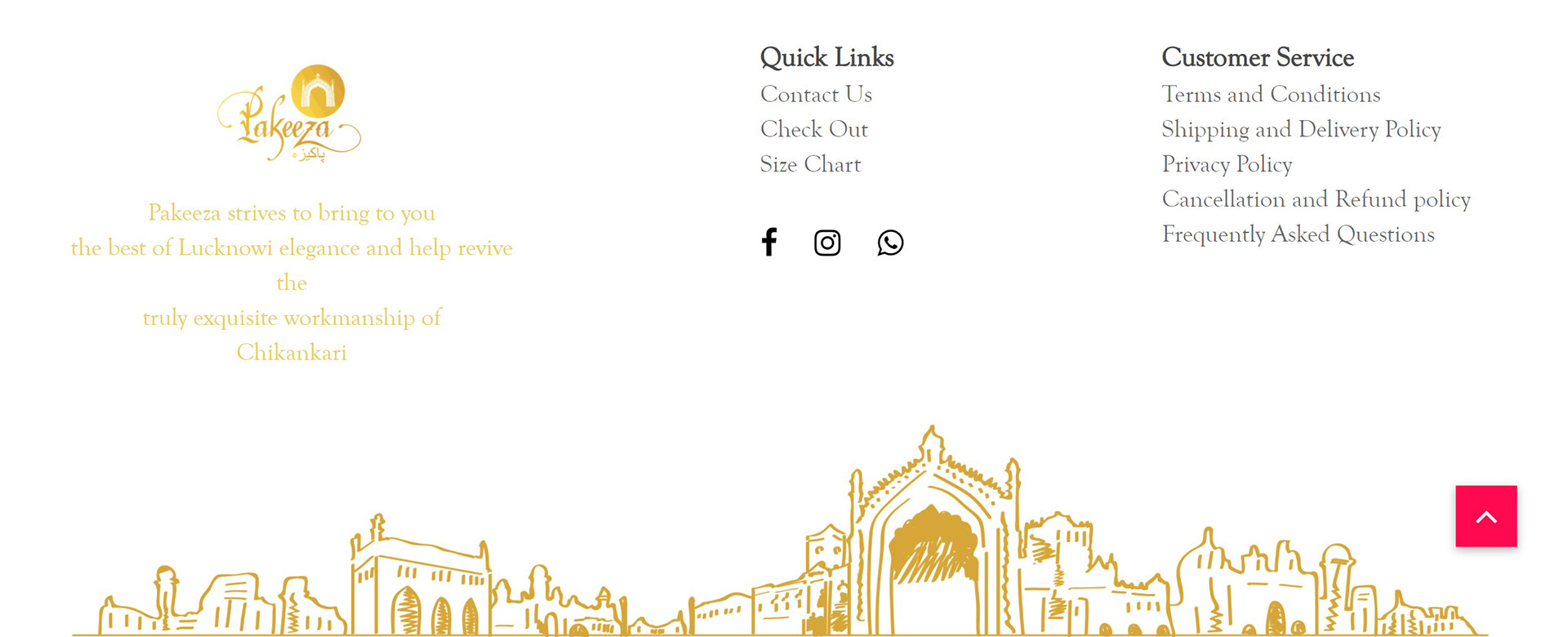
Shown below is a snapshot from their current website showing the elegance the logo brings to the brand.